
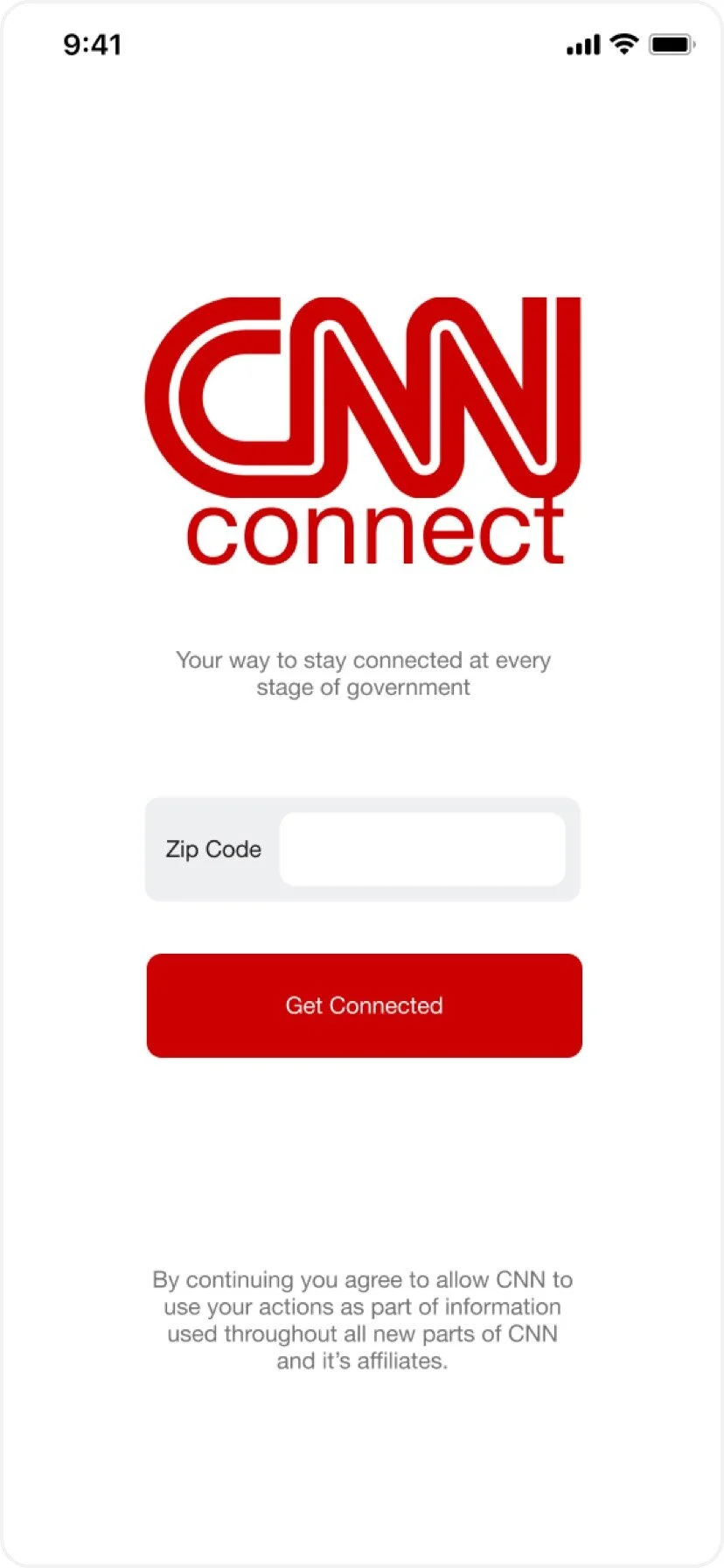
CNN Connect: Mobile App
User experience and user interface design for an extension of the CNN app
Voting: It’s what makes us a democracy. Yet, we find that overall voter participation is low for presidential elections, and even lower for local elections. This poses the question: How can we increase voter participation, especially in non-presidential years? I was a part of a group project with 3 other UX designers to try to solve this issue through a mobile app.
My Role
Researcher and designer
Team Members
Brad La Pointe
Ryan Lutseg
Fatima Alsrogy
Duration
2 Weeks
Tools & Methods
• Figma
• User Interviews
• Affinity Mapping
• Competitive Analysis
• Comparative Analysis
• Sitemapping
• User Flows
• Task Flows
• Usability Testing
• Journey Maps
The Problem
The current CNN application doesn’t have a well-defined election section, and typically only covers news about well known candidates. Our group found ourselves asking if there was a way to engage people more during elections, and if there was, what did it look like?
How can we help to increase voter participation during local, state, and national elections, especially during non-presidential election years?


Competitive and Comparative Analyses
Given the complexity of the app, we knew we would have to start with extensive research. We brainstormed as a team and came together to agree that some of the most engaging political platforms, in the current moment, were social media platforms. So we decided to do a feature competitive and comparative analysis in an attempt to find any trends that would help give us direction. In the end, these features stood out to be the most important to include in our MVP.
The Results
At this point in time, we saw ourselves potentially creating some type of social media app, where users could follow candidates and measures while also interacting with them through messaging.
The Synthesis
From these results, we decided that exposure to general election information would be an important focus area for our app, but we would need an easy way to filter through all of the information being displayed. We also saw a need for some way for users to message or engage with the candidates and groups in the app.
User Research
While we were conducting our competitive and comparative analyses, we also decided to dive into our user research phase of the project. We conducted user interviews to get a better idea of our user base and start ideating on how to best serve them.
User Interviews & Affinity Mapping
Our team conducted 7 different user interviews of people with varying levels of political involvement. This would give us a breadth of varying thoughts and opinions surrounding politics and what encourages people to engage.
The Results
These results would become a pivotal point for our team, as we saw less of a need to create a social media type of application, but rather a platform to aggregate data, allow users to search within, and display information in a way that wasn’t overwhelming to the user.
The Synthesis
71% of the users we interviewed discussed an interest in being able to see local election information more easily. 57% of the users we interviewed expressed interest in being able to view candidate and bill information more easily, from a single source. And 42% felt that exposure to candidate experience and work history was important when deciding who to vote for.

Katrina Rodriguez
“We all need to be the change we want to see in the world.”
Level of Political Engagement: High
Katrina is actively involved in local politics and lives for the community. She attends every community/town hall meeting and sometimes canvases outside her local Trader Joes in an attempt to get certain measures on the ballot. She often will personally speak to her community about local initiatives that affect her neighborhood.
She is always in the know about her local representatives and follows them on social media in an attempt to engage with them and bring awareness to certain issues. However, she realizes that this is not the best or most efficient platform to engage in politics with, and wishes there was a better solution to help her stay looped in, as well as community members that aren’t so actively involved on a local level.
Katrina’s Journey Map


Collin Jacobs
“I’m just not a political person! I usually only follow presidential elections but the political contention on Facebook is too much.”
Level of Political Engagement: Low
Collin is a photo digitech living in Austin, Texas, and tends to be a passive and mostly uninvolved member of his community, especially when it comes to politics and voting. He doesn’t have the time or motivation to do research to find where to vote, and what to vote for, and is mostly informed through social media. Even though he has friends and family who are actively involved in voting and staying up to date on politics, it’s never been an interest of his. He is open-minded and willing to listen to find out more about his voting options and candidates. He needs an easy and efficient way to find information about elections and would love for the option to engage with candidates.
Collin’s Journey Map

Sketching, Wireframing, Prototyping, & User Testing
Once our personas were well defined, and our team had a clear and aligned vision for our app, we began moving through the app creation steps. We conducted design studios to start ideating key components, pages, and features that needed to be included and then moved into officially wireframing and prototyping for user testing.
Sketching
After conducting Crazy 8’s exercises on our team to drive the overall app vision, I took over coming up with the more detailed sketches. I had multiple ideas of the app home page feed, so I passed off 3 different variations to help my teammate get started on the medium-fidelity wireframes.

Mid-Fidelity Wireframes
After I completed the detailed sketches, I handed them off to my team member, Brad, who was responsible for our first initial round of wireframing and prototyping. In an effort to help with the wireframes, I also compiled a CNN style guide for our team to follow which included colors, typography treatment, logos, and icons. For the design process, our team decided to use Figma for easier collaboration.


User Testing Results
Task Completion Rate
60% of the total users tested were able to complete both user task flows without any major issues or roadblocks.
Task Completion Timing
100% of the users tested were able to complete all assigned tasks under 2 minutes.
Poll Validation Confusion
40% of the users were confused on whether or not their participation in the poll was counted due to the lack of visual cues showing user participation validation.
The MVP
Once our initial round of user testing was complete, and clear areas of improvement had been determined, we moved into the final design phase to create the hi-fidelity prototypes. Since poll validation had created confusion for the user, I focused on improving the interaction design for that feature, as well as creating clearer text hierarchy throughout the app to help establish differing sections. I also fine tuned the app typography, and added in appropriate imagery where ever needed. Once the high-fidelity screens were complete, we conducted a final round of user testing. These results showed a 100% task completion rate without any confusion and great improvement in user interaction on the polling feature from our first round of testing.